


CASE STUDY
CLIENTCanby Telcom
MARKETTelecommunications
PROGRAMBrand system
Co-op telecommunications company (phone, DSL, digital TV) in Canby, Oregon.
11,000+ Canby residents and businesses looking for local phone, DSL, and digital TV service.
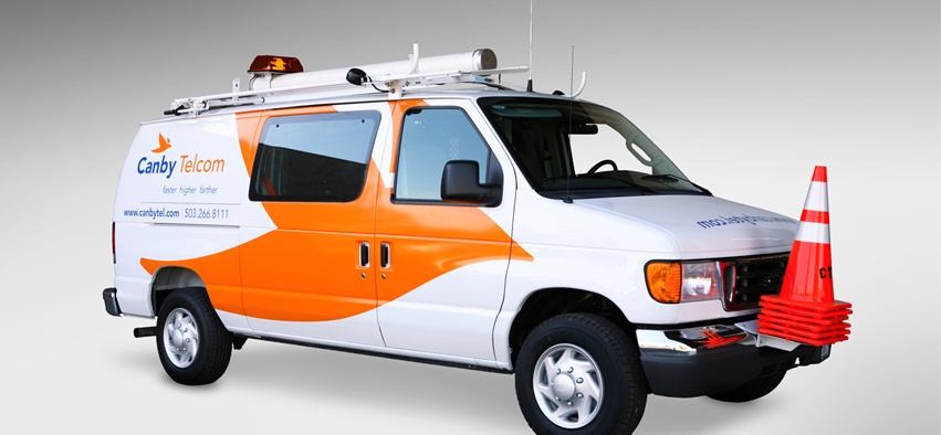
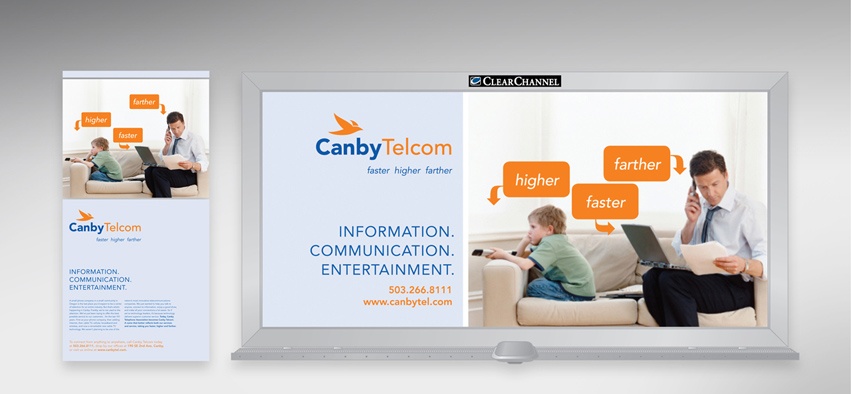
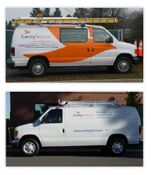
The rebrand was designed around the new name chosen by the board to emphasize to locals that Canby Telcom is more than a phone company. The goal — position the company to successfully compete with larger telecommunications and broadband companies. Create a brand promise to change the perception of being "just a local phone company." Emphasize the scope of services provided and what the customer receives. Apply the brand where people will see it most frequently — on the service trucks — to capture attention and build recognition.
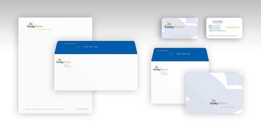
To stand out and connect with the region, an organic form — a bird in flight — was chosen for the logo. Canby Telephone Association became Canby Telcom to emphasize additional technology services. The brand promise of “higher, faster, farther” suggests more capacity and speed. The white service trucks were branded for “Communication. Information. Entertainment.” in addition to the usual “Telephone. Internet. Television.”
The new brand was met with overwhelming acceptance and recognition by businesses, locals and new residents. Comments such as “I’m seeing your trucks everywhere” emphasized the value of the brand on service vehicles. Company trucks and vans had not been noticed, and now became roving billboards promoting the company’s range services. Sales increased across all services categories.
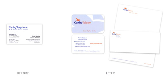
Yes, the brand and image has done what we had hoped. We got great comments from customers, vendors and others in the industry — but the customers are the ones that count. And, the look is great — I love the vans/trunks and signage with the bird!
I wanted a company that focused on branding. Not an ad agency per se, but a branding group. It's easy to find someone to design a logo or create an ad, but I wanted a branding agency. My experience with Jennifer and some of the samples of her work sold me on her ability to take the mundane and breathe life into it. C'mon, telephone companies definitely fall under the mundane.