

CASE STUDY
CLIENTSalem Hospital
MARKETRegional hospital
PROGRAMNutritional publications
The fifth largest healthcare organization in Oregon.
Staff, patients and patient families and friends in the hospital.
Previous patient menus included all menu items on one menu, and were encased in a large plastic holder. This presented problems with both weight and sanitation, and confused patients who were on special diets so food choices were limited. Signing and flyers in the cafeteria and coffee shops was being produced in-house in Publisher and did not meet the new brand standards.
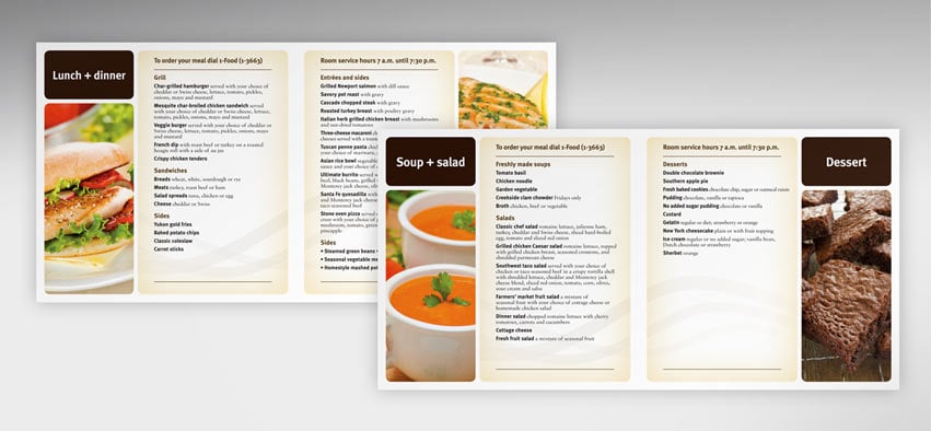
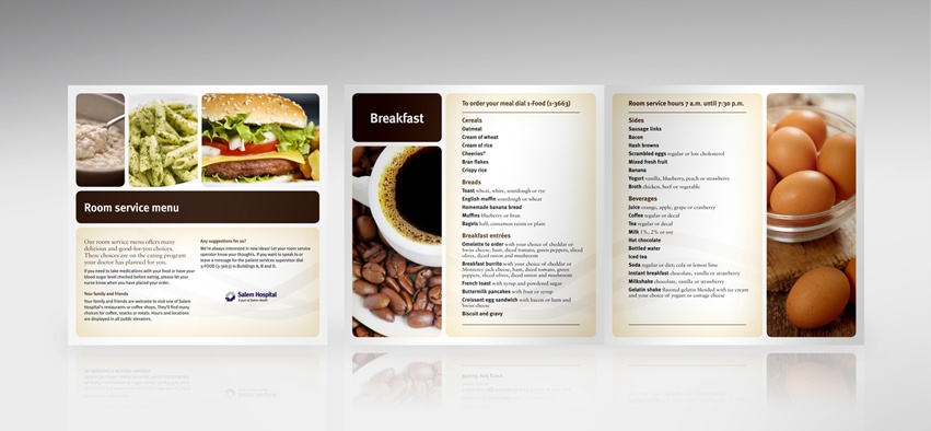
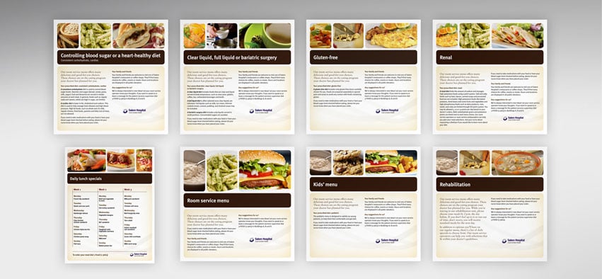
Working with the nursing staff and the nutritional services team, Creative Company designed an eight-by-eight booklet format that was easy to handle, could be produced in Publisher or pre-printed offset. Seven different menus were tailored for special diets and were translated into both Spanish and Russian. The redesigned menus incorporated appealing photos and could be thrown away after use.
Working with the foodservice team, we also designed a system of signing, labels, tent cards, flyers and displays to be used throughout the hospital and in the cafeteria. One system used a swirl element to represent the coffee shops. The other incorporated the streams with existing design elements into consistent, easy to read signing and plasma displays within the cafeteria.
Patients are happier when ordering off their menus, as the food is appealing and menus are easy to read and handle. The signing system supports brand standards within the cafeteria and simplifies ordering. Flyers to promote specials or events are easy to use and update as needed.