CASE STUDY
CLIENTUnited Way of the Mid-Willamette Valley
MARKETMarion, Polk and Yamhill Counties, Oregon
PROGRAM2013 campaign messaging and design
The annual tri-county United Way campaign to raise awareness and dollars.
Employers, workers, individuals, non-profits and community leaders.
United Way in the tri-county region had weathered some bumpy years with changes in leadership and a slow economy affecting giving levels. New Executive Director Randy Franke brings strong leadership and a fresh commitment to the community. When he started in 2012, he knew he needed a higher level of messaging, awareness and visibility for the 2013 campaign. Creative Company was hired to create messaging, then build an updated campaign that would carry the organization forward for the next five years.
 "SILVER WINNER in the Integrated Campaign Category"
Working with the campaign cabinet, and building on the national LIVE UNITED theme, our positioning strategy focused on adding simplicity and calls to action. To keep the message memorable and very shareable, we added “to the Power of 5” to the national slogan. We then designed visual elements that built on the United Way brand standards to add excitement and easy-to-remember visual cues. An effective positioning strategy is both visual and verbal.
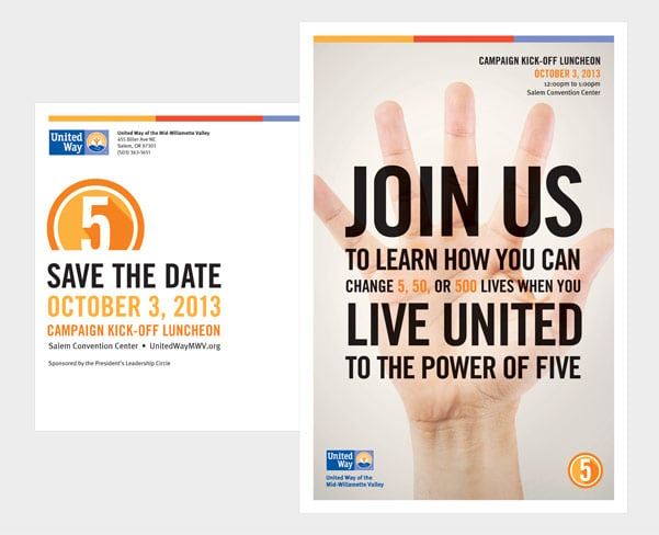 Save the Date postcard for the campaign kick-off.
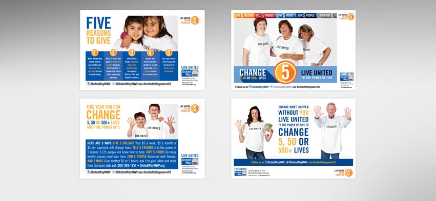
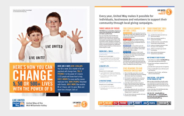 The brochures for donors (above) and for employers (below) emphasize “The Power of 5” and summarize where the dollars go as well as five reasons to give. Employers learn five reasons to bring a campaign to the workplace. Flyers were used as inserts and distributed at events.
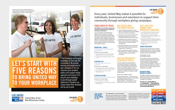
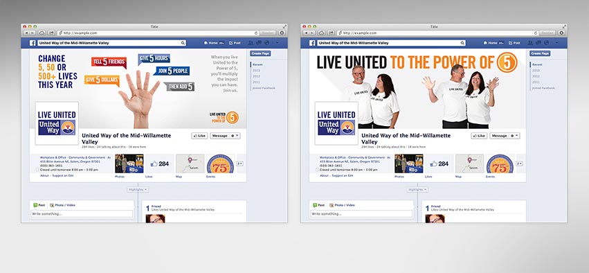
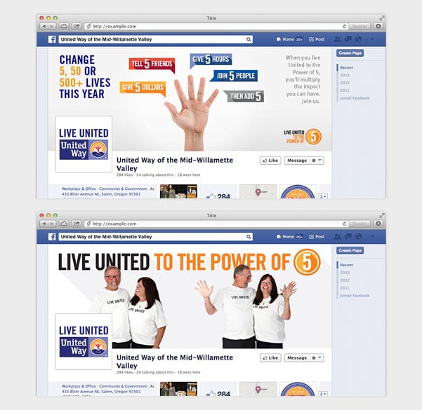 Facebook headers bring more attention to the Power of 5.
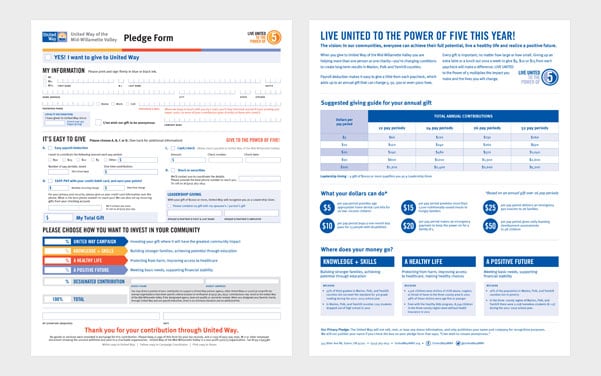 Updated pledge forms made it easier to designate funds, outlined 5 reasons to give, and summarized the impact just $5 could have on the community.
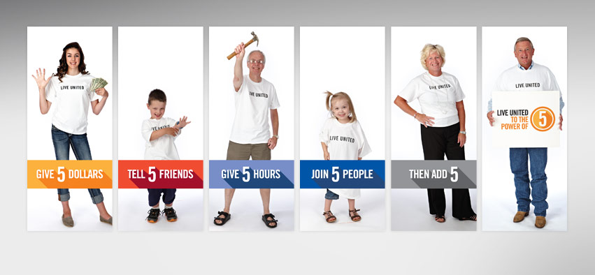
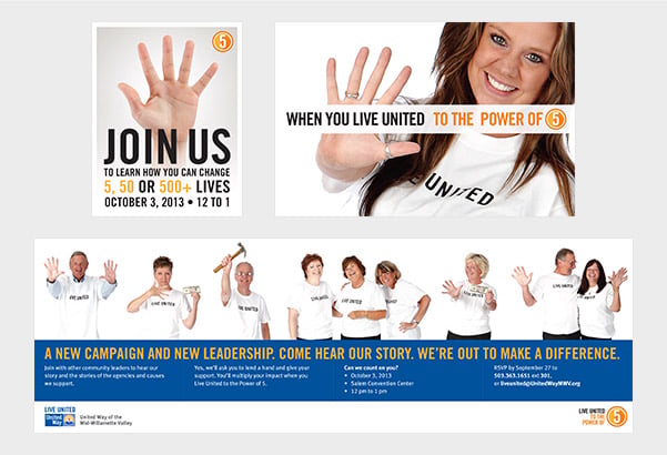 The multiple panel invitation to the campaign kick-off revealed community members who support the campaign with the Power of 5.
By creating 5 simple action statements and adding them to every touch point, we reinforced how easy it is to support United Way, and how even a little bit makes a difference.
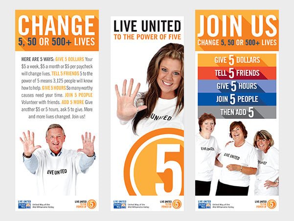 Pull-up banners used at various events bring attention to the key ideas and calls to action for the campaign.
With photos of recognizable local supporters in their LIVE UNITED T-shirts, with hands up, holding a hammer or dollars, we leveraged the national campaign and added energy to every communication.
The positioning strategy integrated key messages and a bright visual system to create a unified, exciting campaign. LIVE UNITED to the Power of 5 will be this region’s campaign theme for the next 5 years, further extending the value of the new communication pieces.
|
|
United Way staff has already found people more receptive to the campaign when they can hold up a hand and say “here are five ways you can support United Way,” or “here are five reasons you should support United Way this year.”