CASE STUDY
CLIENTWillamette Valley Fruit Co.
MARKETPremium produce
PROGRAMBrand refresh
Premium frozen fruit and berries, handmade pies and cobblers from a grower-owned company in Salem, Oregon.
Consumers of frozen fruit and pies in grocery and farm stand retail outlets; retail buyers.
Communicate the product’s premium, hand-crafted quality with a food packaging design system that woos the consumer and stands out on the shelf. Build sales materials with the same natural look.
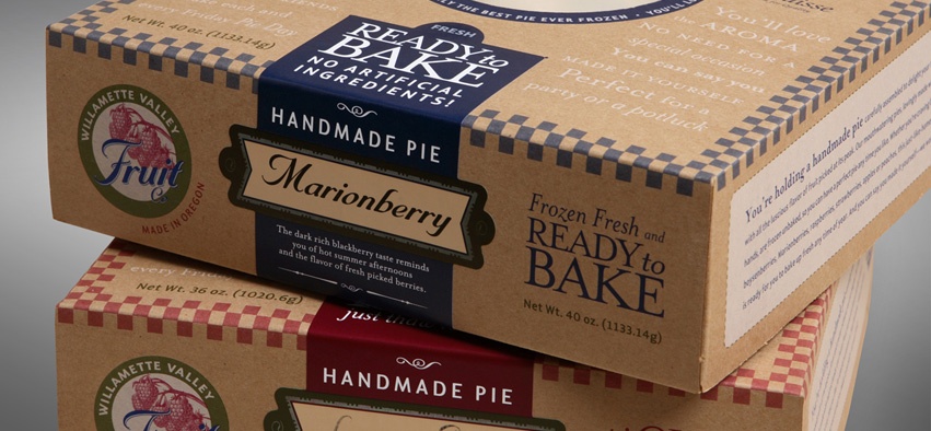
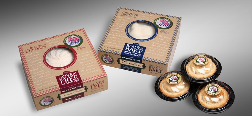
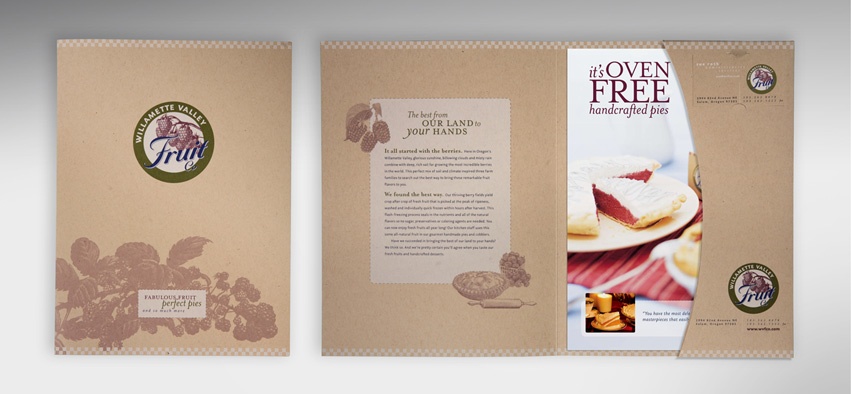
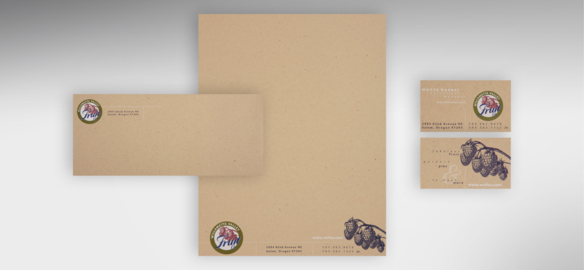
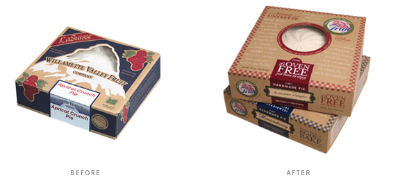
Created an upscale new brand program incorporating distinctive, brown kraft pie packaging. Sales packet and stationery echo the same natural, hand-crafted look. Added “conversation” to the food packaging design and visually distinguished “Oven-Free” cream pies from “Ready to Bake” frozen pies.
Award-winning identity and package design; 33% increase in sales within the first six months; a big increase in brand recognition and product loyalty. The company grew and spun off the pies as Willamette Valley Pie Co.
Our natural, homemade look stands out amidst everyone else’s glossy print and fancy picture style. And customers are making that brand connection between all of our products. We’ve seen a 33% increase in sales due in part to the new brand.

We’ve seen some great growth over the past few years … and a lot of that goes back to the initial branding/logo/sales materials you guys did for us. You certainly gave us a substantial framework to build from. We will always be grateful for the collaboration!