
CASE STUDY
CLIENTSalem Health
MARKETRegional healthcare network
PROGRAMBrand standards
Fifth largest healthcare organization in Oregon, with multiple entities including community outreach, specialized Centers and Institutes, and healthcare partnerships.
Internal leadership and administrative staff, external audiences and the community.
With a recently completed brand identity update, Salem Health needed standards, guidelines, tools and systems to effectively implement the new brand, create brand stewards, and train staff on the importance of brand and its management across multiple entities and hundreds of employees.
The organization’s marketing team was focused on adopting a process; a consistent look across multiple applications; specific elements to support the brand and differentiate it amongst entities; and a brand hierarchy that not only would ensure a successful introduction, but would support the organization as it continues to evolve.
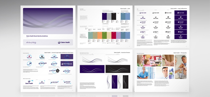
We developed a brand hierarchy system and written guidelines to clearly distinguish each level of the organization and identify which entities have their own version of the logo. Multiple versions of the logo were standardized based on the emphasis of the entity or department name in relation to the Salem Health or Salem Hospital name.
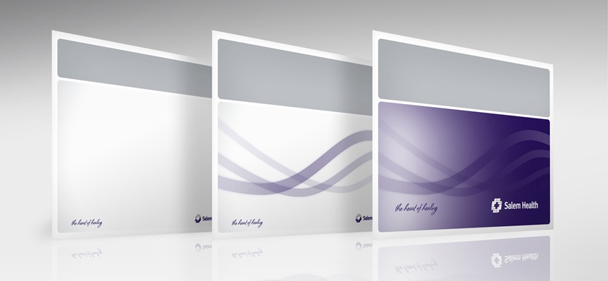
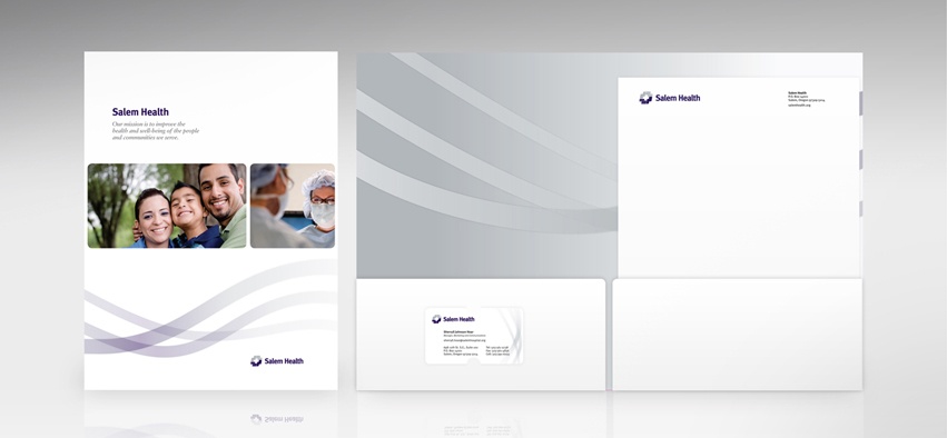
To soften the blocky Salem Health logo/mark, we chose an organic shape that echoes the Ascension statue featured in the Salem Hospital plaza. These “streams” were incorporated as visual elements into everything from stationery to PowerPoint templates to folder and brochure layouts.
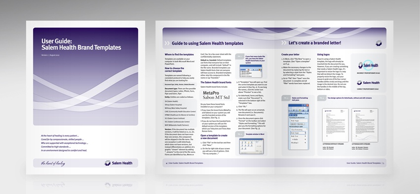
We worked closely with the marketing team to develop tools and templates for internal and external communication materials to support staff adoption and implementation of a cohesive brand identity system.
Creative Company has helped us organize the many levels of logos within our overall brand, and create a cohesive look and feel that still offers flexibility in its final execution.
A multi-page ID Guide summarizes standardized logo formats, proportions and relationships which include the “A part of Salem Health” support message. Other brand elements — brand promise, fonts, correct application of the logo, color palettes, and photography treatment are documented to ensure consistent use.
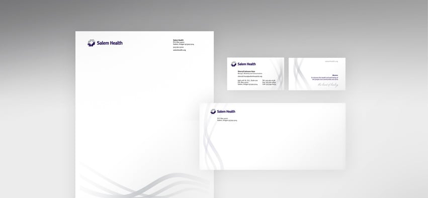
Stationery was designed for easy use as a Microsoft Word® template including background placement of logo and address elements and a style sheet, in addition to printed letterhead and cards.
Templates for staff are built to maintain brand consistency in all communications — Word templates for stationery, forms and flyers; PowerPoint® templates for more than twenty different entities and color palettes; internal electronic display systems. Brand training PowerPoints, a User Guide and intranet site emphasize the importance of brand consistency while providing instruction on the use of templates.
A cohesive, welcoming look integrates all levels of Salem Health communications, from everyday letters to brochures and ad campaigns. Marketing and administrative staff are pleased to have a system that makes their jobs easier while supporting a consistent brand program.
Creative Company helped us organize the many levels of logos within our overall brand .... By creating templates for our in-house team to work with, we created a system to work for the long-term while managing the many applications of our logo and identity efficiently.
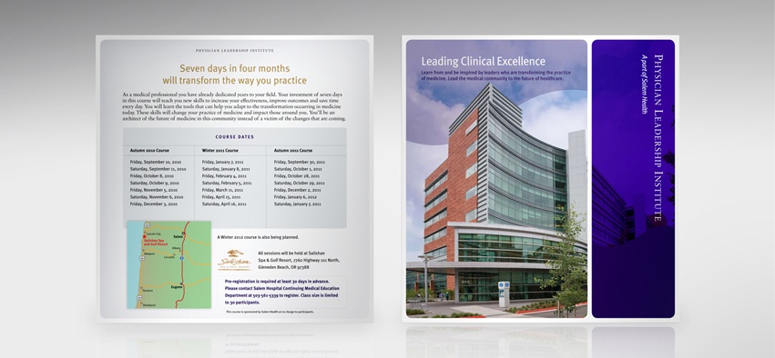
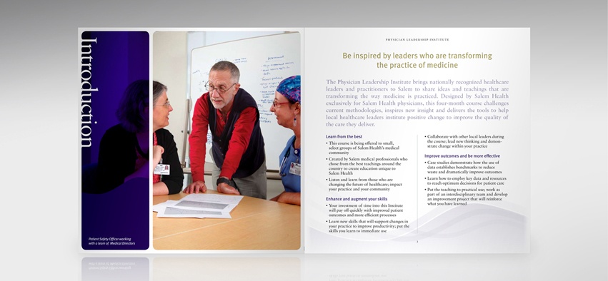
Creative Company has done an incredible job developing a process and format for our ongoing advertising of health education classes and forums, resulting in a consistent look and feel for these materials.