

CASE STUDY
CLIENTTouch of Mink
MARKETConsumers
PROGRAMPackaging system design
An established brand of skin care products containing mink oil, sold through regional fairs and festivals and online.
Men and women who try the products at an event, then reorder online. Consumers looking for high quality skin care products.
The multiple products in various categories with different bottle shapes and designs were very confusing and did not create a coherent brand presence. The existing Touch of Mink script had recognition with loyal users but was not incorporated consistently. Silkscreened bottles were expensive to produce and required maintaining a large inventory, enough pre-printed bottles for each product in each size.
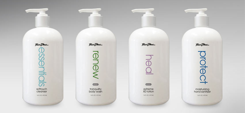
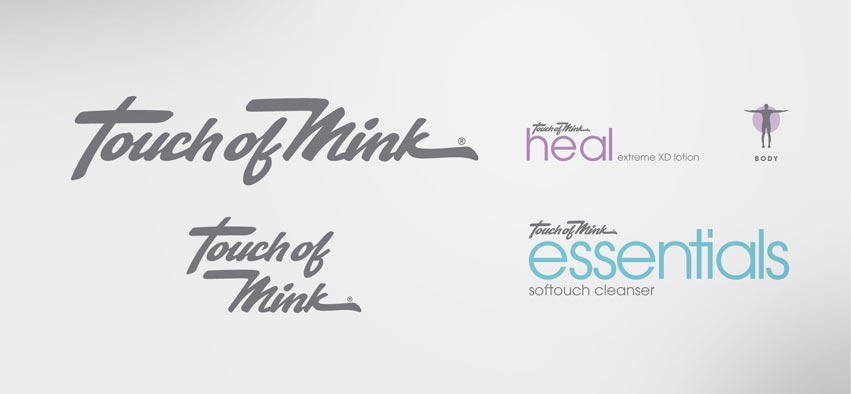
We created four primary categories to help buyers understand how and when to use each product. All products were organized under: essentials, renew, heal and protect. Bottle shapes were standardized for a consistent appearance. The new label design used icons, an updated Touch of Mink wordmark, and a clean visual organization to support a coherent brand. Printed labels rather than silkscreened bottles reduced costs and eliminated inventory issues, while reinforcing the high quality of the products. The standard size and presentation emphasizes the “system” approach and enhances product recognition on the display shelf or on the bathroom counter.
A simplified selling process for the sales team. It’s easier to introduce the categories of products and how each product within the category works. An attractive series of bottles for consumers to keep in their bathrooms. Enhanced recognition of the product and the Touch of Mink brand online and in displays.
This new packaging system has been very well received, people really like the clean, modern look. Its uniformity helps people recognize the system whereas the old packaging was confusing. Our work with Creative Company has been a very good thing for our company.